I’ve seen the same card get two very different reactions just because the frame changed. One version gets a nod. The other gets a squint, like it’s wearing the wrong outfit to the party.
That’s the real reason people search for MTG card templates. Not because they’re obsessed with borders (okay, sometimes). It’s because the frame is doing a ton of invisible work: readability, nostalgia, “does this look like Magic,” and honestly… vibes. If you’re making proxies or custom cards, picking the right template is the fastest way to make them feel like they belong in a sleeve next to real cardboard.
Let’s break down the four big styles you’ll see on mtg.cards: Modern, Vintage, Mystical Archive, and Box Topper.
Here’s the simplest way to think about it.
| Template | What it feels like | Best for | Easy way to mess it up |
|---|---|---|---|
| Modern | “Yep, that’s an MTG card” | Most proxies, Commander decks, playtesting | Low-res art that turns muddy |
| Vintage | Old-school nostalgia | Old-frame cubes, retro decks, throwback gifts | Cramming modern-style text into old spacing |
| Mystical Archive | Fancy “spellbook” showcase | Signature spells, themed decks, flex cards | Using bland art (the frame wants drama) |
| Box Topper | Big art, premium treatment | Commander staples, centerpieces, display prints | Bad cropping (you notice it instantly) |
If your goal is “this should look like a normal Magic card,” start here.
The modern frame is basically the language most players read by default. Wizards’ big shift toward this cleaner, boxed layout kicked off with Eighth Edition, and it’s still the foundation of what cards look like today. The whole point was readability: clearer sections for name, type line, and power/toughness, instead of everything blending together.
So when should you pick the Modern template?
When you’re printing proxies to shuffle into a real deck. When you want your cube to look consistent. When you’re making a playtest version of a list and you don’t want your table to slow down because people can’t parse the text box.
A modern frame also hides minor imperfections better. If your art crop is a tiny bit off, or your rules text runs a little long, it’s less noticeable than on fancier frames.
One practical tip: modern templates reward high-contrast art. If your image is dark-on-dark, the card can look like a brick. Grab brighter art, or art with a clear focal point, and your proxy instantly feels more “real.”
Vintage templates aren’t “worse modern.” They’re a different aesthetic with different rules.
The original Magic frame ran from the game’s early years through the Scourge era, and it has a very specific look: thicker borders, a more “storybook” color palette, and that classic text box vibe. People love it because it feels like early Magic. It hits nostalgia hard.
But here’s what trips people up: old frames have less forgiveness.
If you jam modern-style wording into a vintage template, it can feel cramped fast. If your line breaks are ugly, everyone notices. And if your art crop doesn’t match the older proportions, it can look off even if you can’t explain why.
Use Vintage when:
The upside is huge. When it’s done right, a vintage proxy has this weird magic trick quality: it feels like it’s always existed.
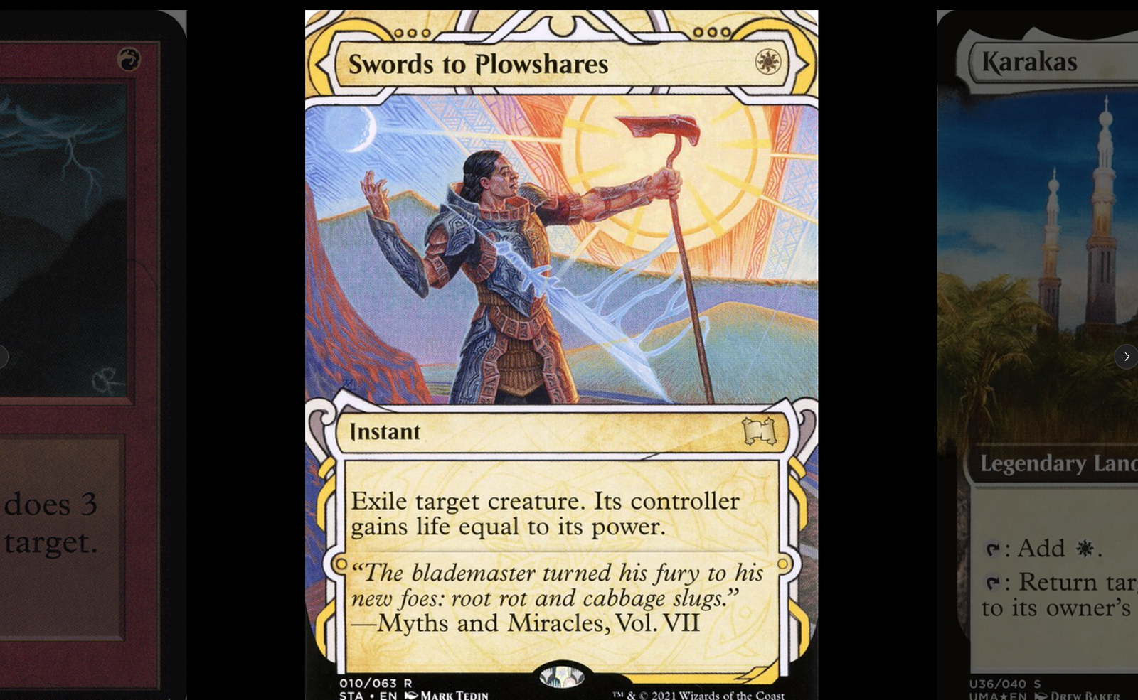
Mystical Archive cards were built to feel like rare spells pulled from a library of ancient magic. Wizards even described the vibe as an “illuminated manuscript” feel, and if you’ve seen them in person, yep. That’s exactly what they were going for.
This template is not subtle, and that’s the point.
If your deck has a signature spell—your pet card, your combo piece, your “this is what my deck does” moment—Mystical Archive is perfect. It turns one card into a centerpiece without needing special foiling or anything else.
This frame loves:
It does not love cramped text. If you’re templating something custom with three paragraphs of rules text, Mystical Archive is going to feel busy. In those cases, modern is usually the better call.
Also, don’t sleep on theme. Mystical Archive frames look best when the art matches the “ancient spell” vibe. If you use goofy meme art (no judgment), the contrast can be funny… but it won’t feel “official.”
Box Toppers are basically Wizards saying, “what if the art was the star?”
In real Magic products, box toppers have shown up as special bonus cards in booster boxes, often with alternate treatments like extended art or fully borderless styles. Mark Rosewater has also spelled out the difference in plain language: extended art pushes the art to the left and right edges, while borderless goes all the way to the edge on every side.
That’s the vibe the Box Topper template is chasing. Less frame. More image.
When Box Topper is the right move:
The #1 failure mode is cropping. Borderless frames make bad crops obvious. If someone’s face is cut off or the focal point is floating too high, you can’t unsee it.
So give yourself permission to spend 30 extra seconds adjusting the artwork position and scale. That one tiny tweak is the difference between “premium” and “why does this feel weird?”
The template is the big decision, but the small stuff is what sells it.
Art resolution matters more than people think. A sharp card with mediocre art still looks legit. A blurry card with great art looks like a screenshot.
Text spacing is the silent killer. If your rules text is mashed together, the brain flags it as “not real.” Even if the words are correct.
Pick frames based on the deck’s purpose. If you’re playtesting, modern is your friend. If you’re building a themed display deck, Mystical Archive or Box Topper can be the point.
And one more thing worth saying out loud: if you’re using proxies, be smart about where you bring them. Wizards has been clear that sanctioned events require authentic cards, and they’re fine with playtest cards for testing ideas—but they care a lot about stopping counterfeits. Casual playgroups are usually where custom templates shine.
If you only remember one thing, make it this: the best MTG card templates are the ones that match the moment.
Modern is your default workhorse. Vintage is pure nostalgia. Mystical Archive is your spellbook flex. Box Topper is your “this card deserves a spotlight” option.
Pick one, make a single card, and sleeve it next to a real one. If it disappears into the deck, you nailed it. If it screams for attention (in a good way), you also nailed it—because sometimes that’s the whole point.