
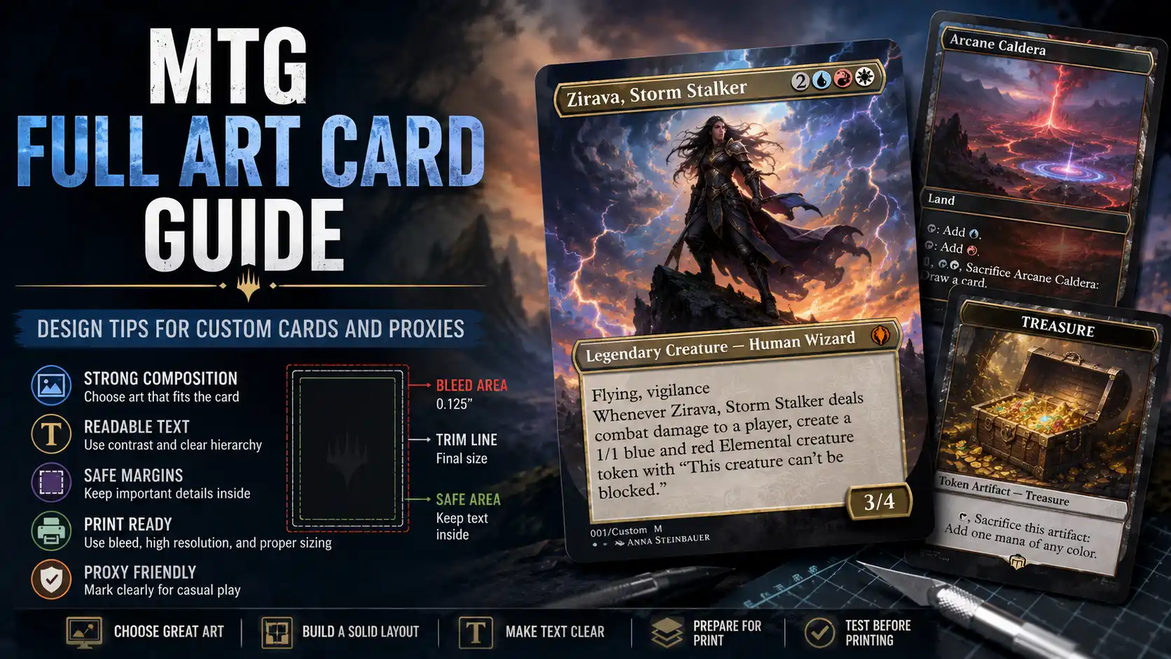
Full art MTG cards look great when they are done well. The art stretches across more of the card, the frame feels less boxed in, and the whole design has a more premium, collector-style feel. When they are done badly, though, they become a tiny fantasy poster with rules text awkwardly glued to the bottom. Pretty, yes. Playable, maybe not.
If you are designing custom Magic cards or proxies, full art layouts give you more visual room, but they also give you more ways to make mistakes. The art has to support the card’s function. The text still has to be readable. The frame still has to tell players what kind of card it is. And if the card will be printed, the file needs enough resolution, bleed, and safe margin to survive the real world.
This guide walks through practical design tips for MTG full art cards, including layout, art selection, rules text, frames, proxy marking, and print setup.
A full art MTG card is a card design where the illustration takes up more space than a traditional Magic frame. In official Magic products, “full art” can refer to several styles, including full art lands, borderless cards, extended art cards, showcase treatments, and alternate frame designs.
For custom cards and proxies, the phrase is usually broader. It can mean any design where the art is the main visual focus and the frame is reduced, blended, extended, or pushed behind the image.
Common full art custom card styles include:
Full art lands
Borderless creature cards
Extended art Commander cards
Custom proxy staples
Alternate art tokens
Showcase-style custom frames
Full art cube cards
Fan-made commanders
Full art cards work best when the image and card function support each other. A dramatic dragon art piece fits a mythic creature. A calm landscape fits a land. A chaotic spell effect fits an instant or sorcery. A random cool image can still look good, but it may not help players understand the card.
This sounds backwards, because full art cards are obviously about art. But for playable custom cards and proxies, readability has to come first.
Players need to identify the card quickly. They should be able to see the name, mana cost, type line, rules text, and stats without picking the card up every time. This matters even more in Commander and cube, where board states get crowded and nobody wants to inspect six custom cards every turn like they are reading museum labels.
A good full art card should make these elements clear:
Card name
Mana cost
Card type
Color identity
Rules text
Power and toughness or loyalty
Proxy or custom marking
If the art makes any of those hard to read, the design needs adjustment. The easiest fixes are adding a subtle text box, darkening or lightening the art behind text, using a stronger font treatment, or moving the crop so the busy part of the image does not sit behind the rules box.
The best full art custom cards feel like the art belongs to the card. That does not mean the art has to be literal, but it should make sense.
A removal spell might show impact, danger, destruction, exile, or magical force. A ramp spell might show growth, nature, treasure, or energy. A counterspell might show interruption, shields, barriers, or opposing magic. A legendary creature should usually show a distinct character, not a vague battlefield scene.
For proxies of existing cards, the art should still communicate the card’s role. If you make a Sol Ring proxy, a glowing ring, artifact, vault, relic, or mana source reads better than a random warrior portrait. If you make a full art Lightning Bolt, the art should probably involve lightning. Groundbreaking advice, yes, but apparently still needed.
When browsing real card references, Scryfall is useful because its image documentation explains that card objects include multiple image sizes and image crops, including art crops where available. That makes it a helpful reference for studying how official Magic art is cropped and framed, even if you are creating your own custom design.
A full art card usually lives or dies by the crop. The same illustration can look incredible or awkward depending on how it is positioned inside the card frame.
Before adding text, test the art crop at actual card proportions. Magic cards are tall and narrow, so wide landscape images often need careful cropping. If the subject is too far to one side, the card may feel unbalanced. If the subject is too low, the rules box may cover it. If the subject is too high, the name and mana cost may crowd the focal point.
A strong crop usually has:
A clear focal point
Room for the name and mana cost
A less busy area behind the rules text
Enough art extending past the trim line if printing full bleed
A subject that still reads at card size
Do not judge the crop only on a large monitor. Zoom out until the image is roughly card-sized. If the subject disappears, the crop is too weak.
Full art cards often fail because the designer puts dark text on a dark image or light text on a bright image. It may look stylish for three seconds, then become irritating in actual play.
For readable full art cards, add contrast behind important text. This can be done with:
A translucent text box
A soft gradient
A dark overlay
A light parchment panel
A blurred background strip
A traditional Magic-style frame element
A subtle shadow behind text
The goal is not to hide the art. The goal is to make the card playable. A rules box that covers 20 percent of the art is better than a gorgeous full art design nobody can read.
This matters for custom cards in particular. Existing Magic cards have established wording and players may recognize them. Custom cards rely entirely on the printed text. If the text is hard to read, the card becomes a table problem.
Custom full art cards can use creative frames, but they should still communicate what the card is. Color and frame cues help players process the game quickly.
A blue instant should feel blue. A green creature should feel green. A land should be visually distinct from a spell. An artifact should not look exactly like a multicolor creature unless there is a clear reason.
Frame cues can include:
Color tint
Mana symbols
Type line styling
Text box color
Border treatment
Set icon placement
Power and toughness box
Legendary crown or name treatment
For custom proxies, familiar structure is usually better than radical reinvention. You can make the card beautiful without forcing players to relearn where the mana cost is. A full art card should be special, not confusing.
The top of the card is prime real estate. In traditional Magic frames, the name sits on the upper left and the mana cost sits on the upper right. You can modify that layout, but be careful.
Players instinctively look to the top of the card for identity and cost. If you place the name vertically, hide it in the art, or put the mana cost at the bottom, the design may look interesting but play worse.
For full art proxies of real cards, keep the name and mana cost especially clear. Players may be using them for deck testing, cube, or Commander games. The point is to make play smoother, not to turn each card into a graphic design puzzle.
Full art design does not excuse bad rules text. If the card is a proxy of an existing Magic card, use the current Oracle text from a reliable reference. If it is a custom card, write the text as cleanly as possible.
Common rules text problems include:
Too many words
Tiny font size
Bad line breaks
Missing punctuation
Incorrect keywords
Unclear timing
Missing power and toughness references
Custom wording that does not match Magic templating
For existing cards, Scryfall card pages are helpful because they provide current card text and card data references. For custom card design, Wizards’ official rules page is the best place to check rules structure and terminology when wording gets complicated.
A simple rule: if you have to shrink the rules text until it looks like a warranty disclaimer, the card probably needs less text.
Full art lands are the easiest full art cards to design because they usually have little or no rules text. That gives the art room to breathe.
For custom full art lands, focus on:
Strong landscape art
Clear color identity
Land type readability
Enough visual distinction between colors
Consistent style across the cycle
A Plains, Island, Swamp, Mountain, and Forest should feel like part of the same set while still being easy to tell apart. This is where color palette matters. A snowy Mountain and a pale Swamp can become surprisingly similar at card size if the values are too close.
Full art lands are also a good practice project before designing full art creatures or spells. If you can make a clean land cycle, you will understand cropping, color, and print setup better before adding rules text.
Tokens are a great use case for full art design. They usually have less text than normal cards, and strong art helps players identify board states quickly.
A full art token should include:
Token name
Type line
Power and toughness if it is a creature
Keyword abilities if needed
Clear token or custom marking
A Treasure token can be mostly art with a small rules box. A Saproling token can use large character art and a bold 1/1 stat box. A Copy token should be visually distinct and clearly labeled so it does not get confused with a normal creature.
For custom token design, avoid overdecorating. Tokens often appear in multiples. A clean design is easier to read when there are ten of them on the battlefield.
If you are designing full art proxies, include a clear proxy or playtest marking. This can be small, but it should be present.
Good proxy labels include:
Proxy
Playtest Card
Not for Sale
Casual Use Only
Custom Proxy
Wizards of the Coast’s Fan Content Policy describes fan content broadly and sets conditions around how fan-created material may be used, including restrictions around commercial use and implying official approval. Full art proxies and custom cards should be designed with that distinction in mind, especially if they use Magic-inspired frames, wording, or visual language.
The point is simple: make the card usable for casual play, not deceptive. Do not add fake security stamps, do not copy official backs for misleading use, and do not sell custom proxies as authentic cards.
A full art card is less forgiving than a standard bordered card. If the image runs to the edge, you need bleed. If the subject sits near the edge, you need a safe margin. If the image is low resolution, the final card will look soft.
For print setup, use:
300 PPI at final size
Correct finished card size
Bleed for edge-to-edge art
Safe margin for text and key details
Print-quality PDF export
PNG or high-quality source images
No accidental print scaling
A common full-bleed setup for poker-size cards is 2.5 x 3.5 inches finished size with 0.125 inches of bleed on each side, making the full document 2.75 x 3.75 inches. Some printers have their own requirements, so always follow the template you are actually using.
Print-focused tools such as PrintMTG’s custom card maker let users choose frames, edit details, upload art, and preview custom MTG cards before ordering prints, which is helpful when you want the design workflow connected to the final physical card.
Full art cards often print darker than they look on screen. Screens are backlit. Paper is not. Dark fantasy art can become muddy when printed, especially if the card has deep shadows and low contrast.
Before printing a full deck or cube, brighten the art slightly and run a test print. Look at the card in normal room lighting, not just under a desk lamp. If details disappear, adjust the image before printing the full batch.
This is especially important for black, blue, and horror-themed cards. Moody art looks great digitally, but printed cards need enough value separation to stay readable.
A single custom full art card can be wildly expressive. A full deck or cube needs more consistency.
If you are designing multiple cards, decide on a visual system before you start. Choose consistent frame treatments, title bars, text boxes, font sizes, stat boxes, and proxy markings. Otherwise, the deck can look like every card came from a different website.
For a Commander deck, you might create:
One frame style for creatures
One for instants and sorceries
One for artifacts
One for lands
Matching tokens
A consistent custom back
For a cube, consistency matters even more. Players are drafting unfamiliar cards quickly. A unified design system helps them understand card types and colors faster.
The most common full art card mistakes are predictable:
Text over busy art
Low contrast rules boxes
Too-small font
No safe margin
No bleed
Weak art crop
Random frame styles
Missing proxy label
Incorrect rules text
Overly dark print files
Art that does not match the card
The sneakiest mistake is designing only for the zoomed-in screen view. Always check the card at actual size. If the design fails there, it fails.
MTG full art cards are a great way to make custom cards, proxies, tokens, and cube pieces feel more polished. They give you more room for art, more room for theme, and more room to make a deck feel personal. But they also demand more discipline.
Start with the card’s function. Choose art that fits the mechanics. Crop it carefully. Keep the name, mana cost, type line, rules text, and stats readable. Use contrast behind text. Add bleed and safe margins before printing. Mark proxies clearly.
The best full art custom cards look exciting without making the game harder to play. That is the balance. A full art card should make someone say, “That looks great,” not “Wait, what does this do?”