
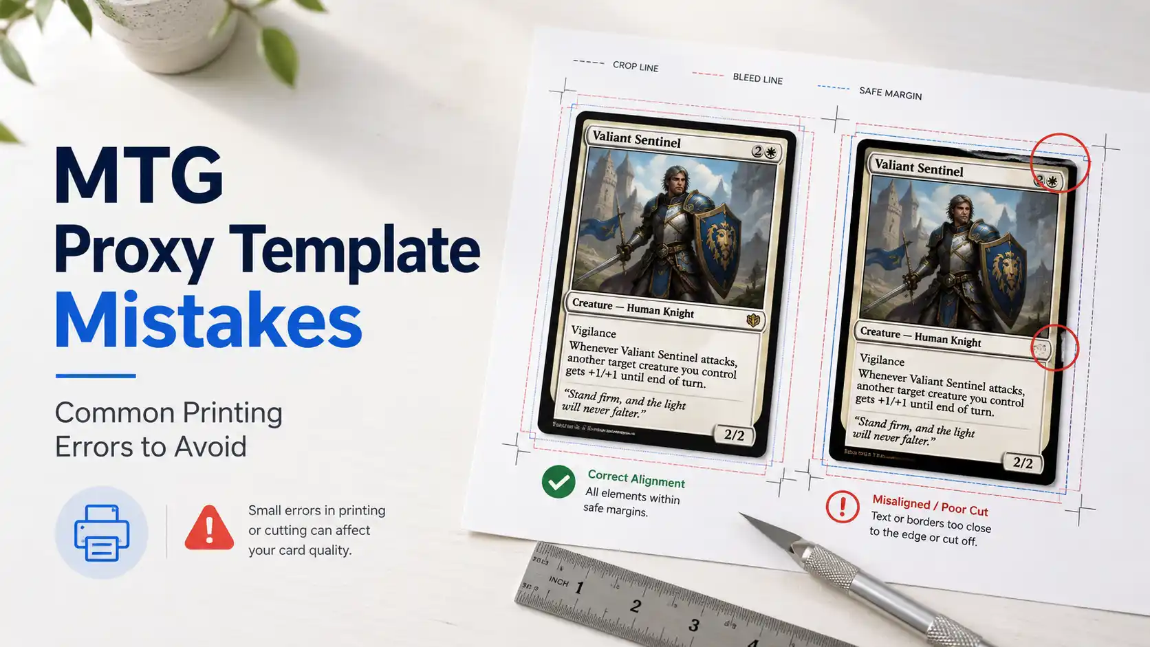
MTG proxy printing sounds simple until the first test sheet comes out 4 percent too small, the text looks fuzzy, and the black border has one elegant little white strip along the edge. That is usually when people realize the template matters as much as the card image.
A good MTG card printing template controls size, bleed, margins, resolution, layout, file format, and final print scaling. A bad template can make even a nice proxy design look amateurish. Worse, it can create cards that feel different in sleeves, which is a gameplay problem, not just a design problem.
This guide covers the most common MTG card printing template mistakes to avoid before printing proxies, custom cards, tokens, or cube cards.
The first mistake is also the easiest to miss: using the wrong finished size.
A standard Magic: The Gathering card is about 63 x 88 mm, which is close to 2.5 x 3.5 inches. Many playing-card printers use 2.5 x 3.5 inches as a standard poker-card template, while MTG-specific layouts often use 63 x 88 mm as the closer reference. Either can work depending on your print method, but you need to be consistent.
The problem starts when one deck uses mixed sizes. Some cards are slightly wider. Others are slightly shorter. In sleeves, that can make proxies feel different from the rest of the deck. In casual play, that is annoying. In any more structured setting, it can become a marked-card concern.
Before printing, confirm:
Finished card size
Bleed size
Safe area
Page size
Final print scale
If you are ordering through a proxy-focused workflow such as PrintMTG, use the printer’s own template and upload requirements instead of guessing. PrintMTG’s FAQ notes that its proxy printing service can take an entire deck as input and print it on demand, which is exactly the kind of workflow where consistent sizing matters across the whole order.
Even if your file is built correctly, your printer can still betray you. Very on-brand for printers.
The most common home-printing problem is accidental scaling. Print menus often default to settings like “fit to page,” “shrink oversized pages,” or “scale to printable area.” Those settings are useful for office documents. They are terrible for cards.
For MTG proxies, print at 100 percent scale. Do not let the software resize the page. If the card is designed at the correct size and then printed at 96 percent, it will be visibly wrong once sleeved with real cards.
Before printing a full deck, print one test page and measure a card with a ruler. Then sleeve it in front of a basic land and compare it to the rest of the deck. If it feels off, fix the print settings before wasting a whole stack of paper.
Bleed is the extra image area that extends beyond the final trim line. It gets cut off after printing. Without bleed, small cutting shifts can leave white edges around the card.
For a 2.5 x 3.5 inch card, a common bleed setup adds 0.125 inches on each side, creating a full document size of 2.75 x 3.75 inches. Some printers use different requirements, so always check the template.
This mistake is most obvious on full-art or borderless proxy designs. If the art stops exactly at the cut line, any slight trim shift can expose blank paper. Bordered cards are more forgiving because a black border can hide small movement, but full-bleed cards need the extra artwork.
A proper template should include:
Bleed area
Trim line
Safe area
Artwork extended past the trim
No important text inside the bleed
Bleed is not optional decoration. It is insurance against real-world cutting.
The safe margin is the area inside the trim line where important content should stay. If the card name, mana cost, type line, rules text, or power and toughness sits too close to the edge, it may get clipped or look uneven after cutting.
A practical safe margin for MTG proxy templates is about 0.125 inches inside the trim line. More is safer, especially for custom card templates. Less can work, but it leaves very little room for trimming error.
Keep these inside the safe area:
Card name
Mana cost
Type line
Rules text
Power and toughness
Loyalty or defense
Set marker
Proxy label
Artist credit if used
QR code if used
A common beginner mistake is making the art larger and pushing the frame elements outward. It looks dramatic on screen, then prints like the card is trying to escape itself.
Low-resolution images are one of the fastest ways to make a proxy look bad. The art may seem fine on a monitor, but print is less forgiving. Small text, mana symbols, and frame details can turn soft or jagged quickly.
For print, aim for 300 PPI at final size. For a 2.5 x 3.5 inch finished card, that means about 750 x 1050 pixels before bleed. With 0.125 inches of bleed on all sides, a 2.75 x 3.75 inch full-bleed file should be about 825 x 1125 pixels at 300 PPI.
Higher resolution is fine if the source is actually sharp. But do not just upscale a tiny image and assume it is fixed. Upscaling a blurry file mostly creates a larger blurry file. A heroic failure, but still a failure.
Scryfall can be useful when checking card versions and image availability because its API documentation explains that card objects include image URI fields and multiple image sizes or crops. That does not mean every image is automatically perfect for every print workflow, but it is a stronger starting point than grabbing a random compressed image from a search result.
JPG is convenient, but it is not always your friend. JPG compression can create artifacts around text, symbols, and high-contrast edges. The more times the file is saved and resaved, the worse this can get.
For individual card images, PNG is usually safer because it is lossless. For final sheet layout, PDF is usually the better export format because it preserves placement, page size, and print scaling more reliably.
A cleaner workflow is:
Create or export card fronts as PNG
Place them into a properly sized layout
Export the full page or deck as a print-quality PDF
Print the PDF at 100 percent scale
Avoid using screenshots as source files. Screenshots are often lower resolution, color-managed oddly, and cropped inconsistently. They are fine for showing someone a deck idea. They are not ideal for a clean print template.
Not all PDFs are equal. A PDF made for emailing or web viewing can compress images heavily. That is useful when you are sending a proposal to someone. It is bad when you are printing tiny card text.
Avoid export presets such as:
Smallest file size
Web PDF
Screen PDF
Low-quality PDF
Compressed proof
Use a print-quality export preset instead. Check that images are not being downsampled too aggressively. Embed fonts or convert text to outlines, depending on your workflow and printer requirements. If the file includes bleed, make sure the export actually includes it.
Another easy mistake is exporting the correct card art onto the wrong page size. Open the final PDF and check the page dimensions before printing or uploading. Do not assume the software kept your settings. Software has a rich inner life and cannot be trusted with cardboard.
Template guides are helpful while designing. They are not supposed to appear on the final card face.
Before exporting, check for visible layers that should be hidden:
Bleed guide
Safe margin guide
Trim box
Crop notes
Template labels
Placeholder text
Ruler marks
Non-print notes
Crop marks can be useful on a sheet layout, but only outside the card area. Do not place cut lines over the card face. If you do, every proxy will have little guide marks on it, which is not quite the premium look most people are chasing.
For professionally printed cards, include crop marks only if the printer asks for them. Some printers want clean files without marks because their imposition software handles cutting separately.
A proxy is a game piece first. It has to be readable.
Custom cards are especially prone to tiny text. Someone writes a card with six abilities, three modes, two triggered effects, and a paragraph of flavor text, then shrinks everything until it technically fits. The result may look like a Magic card, but it plays like a tax form.
For existing cards, keep the official rules text readable. For custom cards, edit the wording before you shrink the font into dust. Use line breaks carefully. Keep reminder text italicized if you use it, but do not let style override clarity.
Check readability at actual print size, not zoomed in on your screen. A design that looks clean at 200 percent may be painful at 2.5 x 3.5 inches.
Double-faced cards, split cards, adventures, sagas, battles, planeswalkers, rooms, aftermath cards, and modal double-faced cards can all create layout problems.
Common mistakes include:
Only printing one face of a double-faced card
Forgetting the back face name
Cropping split cards badly
Leaving out loyalty or defense
Using the wrong type line
Missing saga chapter formatting
Making adventure text unreadable
For double-faced cards, decide how they will be handled before printing. Some players print both faces as separate proxy cards. Some use checklist-style placeholders. Some print a front and back version if the entire deck uses opaque sleeves and matching proxy backs. Whatever method you choose, keep it consistent.
If you are printing full proxy cards rather than paper inserts, backs matter. Inconsistent backs can make cards identifiable. Even slight differences in color, brightness, alignment, or finish can stand out in a sleeved deck.
For proxy cards, a custom back is often better than trying to imitate an official back. It can include “Proxy,” “Playtest Card,” or “Not for Sale” language so the card’s purpose is clear.
Wizards of the Coast’s proxy policy says sanctioned events require authentic Magic cards, with judge-issued proxies allowed only in limited cases when a card is damaged during an event. It also clearly separates playtest cards from counterfeits. That is why clear proxy marking is a good habit, especially for printed cards that look polished.
If you are printing sleeve inserts, card backs do not matter as much because the insert sits in front of a real card or bulk card. Use opaque sleeves anyway. Transparent sleeves and proxies are usually a bad combination.
A proxy that is the right visual size can still feel wrong if the stock is different. Paper inserts are usually fine when sleeved in front of basic lands. Standalone proxies need more consistency.
Avoid mixing:
Different paper weights
Different finishes
Glossy and matte proxies
Thin home prints with thick printed cards
Cards from different print runs with obvious size changes
Unevenly cut cards
If one proxy feels thicker or stiffer than every other card, players may be able to identify it by touch. For casual testing, that may not matter much, but it is still distracting. For a full cube or long-term proxy deck, consistent materials make the whole project feel better.
Many proxy projects focus only on the main deck and forget the support pieces. Then the deck gets to the table and someone needs a Treasure token, a Monarch card, a Day/Night marker, a Dungeon, a copy token, and three different creature tokens. Naturally, nobody has the right ones.
If you are already building a print template, include the tokens and helper cards you know the deck needs.
Useful extras include:
Creature tokens
Treasure, Clue, Food, Blood, and Map tokens
Copy tokens
Emblems
Monarch
Initiative
Day and Night
Dungeons
Keyword reminder cards
Commander tax tracker
Storm count card
For tokens, make sure the name, type, color, abilities, and power/toughness are clear. Tokens do not need to be fancy. They need to be obvious.
File organization is boring until it saves you from printing the wrong version. A messy folder full of “final,” “final2,” “newfinal,” and “actuallyfinal” files is how mistakes sneak into print.
Use file names that identify the project and version:
meren_proxy_deck_fronts_v2.pdf
cube_540_proxy_sheets_v4.pdf
izzet_tokens_36cards_v1.pdf
custom_commander_cards_bleed_v3.pdf
Keep source files separate from final print PDFs. Archive old versions if needed, but do not leave them sitting next to the current file with nearly identical names. The wrong PDF will always be the one you upload at 1 a.m.
Skipping the test print is the great classic. It saves five minutes and can cost an entire reprint.
Always print one test sheet first. Cut one card. Sleeve it. Compare it to a real Magic card. Check the size, readability, color, borders, and feel.
A test print should answer:
Is the card the right size?
Did the printer scale the page?
Is the text readable?
Are borders aligned?
Is anything too close to the edge?
Does the color look too dark?
Does it fit cleanly in a sleeve?
Does the paper insert feel obvious?
If the test fails, adjust the template and try again. One test sheet is cheap. A full cube printed wrong is a small cardboard tragedy.
Before printing your MTG card template, check the following:
Correct finished size
Bleed included where needed
Safe margins protect all important text
Images are high enough resolution
Cards are placed at actual size
PDF is exported for print quality
No unwanted guide layers are visible
Page scaling is set to 100 percent
Card backs are consistent
Proxy or playtest marking is clear
Tokens and helper cards are included
File names are organized
One test sheet has been printed and checked
That checklist is not glamorous, but it prevents most printing problems.
Most MTG card printing template mistakes come from small assumptions. The file probably printed at the right size. The image probably has enough resolution. The PDF probably kept the bleed. The backs probably match. The printer probably did not resize anything.
That is a lot of “probably” for a project that needs precise rectangles.
The best way to avoid mistakes is to build the template carefully, export for print, test one sheet, and only then print the full deck or cube. Pay attention to size, bleed, margins, image quality, PDF setup, card backs, and proxy markings. Do that, and your proxies will look cleaner, sleeve better, and cause fewer mid-game complaints from the person across the table who always notices everything.