
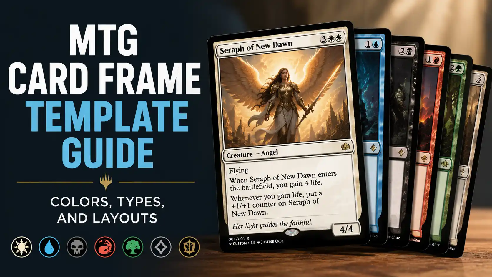
An MTG card frame template is the structure that makes a custom Magic card readable. The frame tells players the card’s color, type, mana cost, rules text, rarity, and combat stats before they read every word.
For most custom cards, start with a normal modern frame. Use the correct color frame, keep the type line clean, and avoid fancy layouts until the card actually needs them. Special frames like sagas, split cards, adventures, battles, and planeswalkers are useful, but they add complexity fast.
If you are making custom Magic cards for casual play, readability matters more than decoration.
An MTG card frame template is not just a decorative border. It is a visual system.
Players use the frame to understand a card quickly. The top line shows the card name and mana cost. The art tells the player what the card represents. The type line explains what kind of card it is. The text box explains what the card does. The lower-right corner may show power and toughness, loyalty, or defense depending on the card type.
Wizards’ own Anatomy of a Magic Card breaks down these basic parts, and the official Comprehensive Rules list core card parts like name, mana cost, illustration, color indicator, type line, expansion symbol, text box, power and toughness, loyalty, defense, legal text, and collector number.
That structure matters when you are making custom cards. A cool design can become frustrating if the frame does not communicate clearly. A custom card should feel easy to read at the table, not like a graphic design puzzle.
A normal MTG card frame has a few core zones.
The card name goes in the upper-left corner. The mana cost goes in the upper-right corner. The art box sits in the upper half of the card. The type line sits directly below the art. The rules text and flavor text go in the text box. Creatures use the lower-right corner for power and toughness. Planeswalkers use loyalty. Battles use defense.
For custom cards, these pieces should stay where players expect them.
A readable custom card should include:
The most common mistake is trying to make every field interesting. Do not. The frame should mostly disappear while people play. The design can have personality, but the information has to come first.
Color is one of the first things players notice on a Magic card. A white card should look white. A blue card should look blue. Multicolor cards should read as multicolor. Artifacts, lands, and colorless cards should not look like colored spells by accident.
Magic’s five colors are white, blue, black, red, and green. Color is usually determined by mana cost, though color indicators and rules text can matter in specific cases. Scryfall is useful for checking official color, color identity, Oracle text, and printed examples before building a custom version. A quick search on Scryfall can save you from copying an outdated frame choice or wording pattern.
Here is the practical frame-color breakdown:
| Frame Color | Use It For | Notes |
|---|---|---|
| White | White spells and creatures | Often used for order, protection, small creatures, removal, and team effects |
| Blue | Blue spells and creatures | Common for card draw, counterspells, bounce, flying, and control effects |
| Black | Black spells and creatures | Used for discard, sacrifice, reanimation, removal, and life payment |
| Red | Red spells and creatures | Common for damage, haste, impulse draw, artifacts, and temporary mana |
| Green | Green spells and creatures | Used for ramp, creatures, counters, fight effects, and land interaction |
| Gold | Multicolor cards | Use when the card has two or more colors in its mana cost |
| Hybrid | Hybrid mana cards | Usually uses a split or blended color treatment |
| Artifact | Artifacts and many colorless cards | Do not use just because the card is “mechanical” in flavor |
| Land | Lands | Lands usually have no mana cost |
| Colorless | Colorless nonartifact spells | Best for Eldrazi-style or true colorless designs |
The frame should match the card’s actual gameplay identity, not just the art. A red-looking dragon with a green mana cost is still a green card. A silver robot with a blue mana cost is not automatically an artifact unless the type line says Artifact.
The card type controls more of the template than many new designers expect.
A creature needs power and toughness. A planeswalker needs loyalty and loyalty abilities. A battle needs defense. A land normally has no mana cost. An instant or sorcery does not need a permanent-style stat box. A saga needs chapter markers. A vehicle is an artifact, but it also needs power and toughness because it can become a creature.
The main card types are:
There are also supertypes like Legendary, Basic, Snow, and Ongoing, plus subtypes like Human, Wizard, Equipment, Aura, Forest, Shrine, Jace, and Siege. The type line has to carry all of that without becoming a mess.
A clean type line might look like:
Legendary Creature — Human Wizard
Artifact — Equipment
Enchantment — Aura
Battle — Siege
Land — Forest Island
The dash matters. Magic uses an em dash between card types and subtypes, but if your editor does not support that easily, use a clean long dash or copy the formatting from an official card.
For custom designs, avoid overloaded type lines unless the card truly needs them. “Legendary Artifact Enchantment Creature — God Equipment Clue” might be technically possible in a joke design, but it is not a good starting point.
Most custom MTG cards should start with a normal modern frame.
That means a standard vertical card with name and mana cost at the top, art in the upper middle, a type line below the art, a text box below that, and stats in the lower-right corner when needed.
This layout works for most designs:
The normal frame is also the easiest to print and sleeve. It leaves space for the important parts and does not require players to learn how to read a custom layout.
If you are using a tool like MTG.Design to make a custom card in your browser, start with a basic frame first. Get the card working before worrying about alternate frames, showcase treatments, or unusual text boxes.
A good custom card usually looks a little boring at first. That is not a problem. Boring means readable.
Special MTG layouts are useful when the card’s rules need them. They are not automatically better.
A split card needs two half-cards because it has two different spells. An adventure card needs the creature and the adventure spell visible on one card. A saga needs chapter abilities. A modal double-faced card needs two full card faces. A battle needs defense and protector-related clarity.
Here are the common special layouts:
| Layout | Best Use | Design Warning |
|---|---|---|
| Split card | Two related spell options | Each half needs to be readable |
| Adventure | Creature plus one spell mode | Keep both sides simple |
| Saga | Sequential chapter effects | Do not overload every chapter |
| Planeswalker | Loyalty abilities | Use clear plus, minus, and ultimate abilities |
| Battle | Siege-style custom designs | Make defense and transformation clear |
| Modal double-faced card | Two playable faces | Requires both sides to be designed cleanly |
| Transforming double-faced card | One card changes into another | Works best when the transformation is central |
| Prototype | Alternate casting mode | Easy to clutter if the card already has lots of text |
| Level up | Creature grows through levels | Needs careful spacing and simple text |
Use a special layout when it solves a problem. Do not use it just to make the card look rare.
A custom commander with one clean triggered ability does not need a saga frame. A simple removal spell does not need to be a split card. A token does not need a showcase treatment. The frame should serve the gameplay.
For Commander cards, color identity matters more than the visible frame alone.
A commander’s color identity includes mana symbols in its mana cost and rules text, plus any color indicator. This is why a card can create deck-building restrictions even if its frame does not immediately show every color involved.
If you are designing a custom commander, check similar cards on EDHREC or deckbuilding sites like Moxfield to understand how real Commander cards are framed, worded, and supported by actual deck themes. Do not copy designs blindly, but do use real cards as guardrails.
The card frame should make the commander’s colors obvious. If the card has a three-color identity, the design should not look like a mono-black creature unless there is a good reason. Players should not have to audit every mana symbol to understand what deck the commander belongs in.
The text box is where many custom cards fall apart.
Too much rules text makes the card hard to read. Too many line breaks make it look unfinished. Too much flavor text crowds the actual gameplay. Tiny font may look fine on a monitor but becomes painful inside a sleeve.
A clean text box should follow a few rules:
Use Scryfall to find official cards with similar effects. If your custom card says “When this enters, destroy target guy,” look up real cards and see how Magic words that effect. Usually it should be something like “When [this creature] enters, destroy target creature.”
That kind of small cleanup makes a custom card feel much more natural.
If the card is going to be printed, design it with printing in mind from the start.
A standard Magic card is about 2.5 by 3.5 inches, or roughly 63 by 88 mm. A home-printed proxy usually works best when printed on paper, cut out, and sleeved in front of a real Magic card or basic land.
Keep important text and art away from the edge. Slight cutting errors are normal at home. If your name line, mana cost, or power and toughness sit too close to the border, the card may look uneven after trimming.
For larger batches, a proxy printing workflow can be easier than managing every file manually. A site like PrintMTG can help when you want to move from custom files or decklists into printed proxy cards for casual use. For a one-off custom card, home printing is fine. For a cube or full deck, batching matters.
The most common mistake is choosing the wrong frame because it “looks cooler.” A planeswalker frame should be for planeswalkers. A saga frame should be for chapter-based enchantments. A battle frame should be for battles. The frame is not just decoration.
Other common mistakes include:
Most of these are easy to fix. The hard part is being willing to simplify the card.
A custom Magic card should pass the sleeve test: can someone pick it up across the table, understand the basics, and play against it without asking five layout questions?
If yes, the frame is doing its job.
An MTG card frame template is a usability tool first and a style choice second. The colors, type line, text box, stats, and layout all help players understand the card quickly.
Start with a normal frame. Match the color to the card’s actual mana and identity. Choose the correct type layout. Keep the text readable. Use special frames only when the card’s mechanics need them.
A good custom Magic card does not need to look overloaded. It needs to look playable.